6.2: Visualizing the Data#
If you would like to download this Jupyter notebook and follow along using your own system, you can click the download button above.
In this section, we will create data visualizations from the data we created in the first 5 chapters. We will use the pandas, numpy, and matplotlib Python libraries to create these data visualizations.
Before we get started, we need to import pandas and numpy, and allow matplotlib to plot our visualizations inline.
%matplotlib inline
import pandas as pd
import numpy as np
Visualizing wordcount data#
Let’s start with the wordcount data, just like we did last section. Instead of aggregating using pandas, however, we will create a histogram using matplotlib. Thankfully, pandas has a matplotlib integration that makes plotting as easy as adding a .plot() to the end of a dataframe.
words = pd.read_csv('../data/wordcount.csv')
words.words.plot(kind='hist', bins=20, title='Total words')
<Axes: title={'center': 'Total words'}, ylabel='Frequency'>
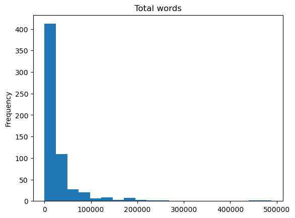
The data is very right-skewed, with most of the documents having fewer than 100,000 words, but we can that see a couple documents have almost 500,000 words. If we were going to use this wordcount data for some kind of modelling, we would probably want to transform it in some way. Let’s look at what the log of the data looks like.
np.log(words.words).plot(kind='hist', bins=20, title='Total words')
<Axes: title={'center': 'Total words'}, ylabel='Frequency'>
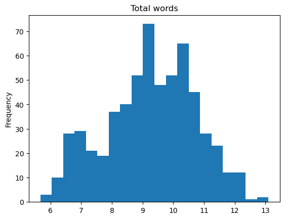
Wow! The log of the data is very close to normal, despite the heavily skewedness of the raw data.
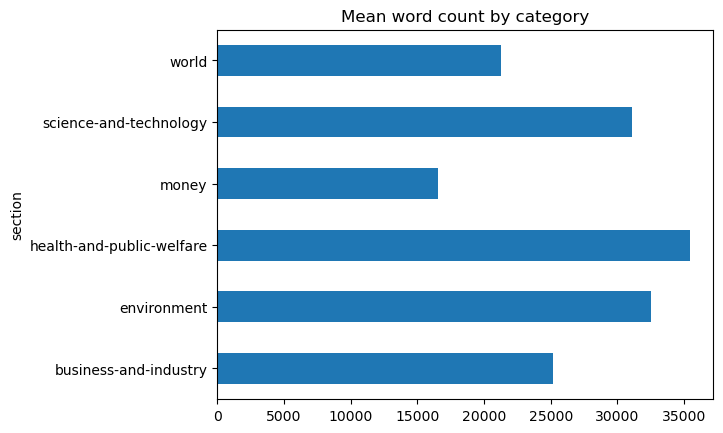
Now let’s use visualize the aggregations from section 6-1.
words.groupby('section').words.mean().plot(
    kind='barh', title='Mean word count by category')
<Axes: title={'center': 'Mean word count by category'}, ylabel='section'>
words.groupby('section').words.median().plot(
    kind='barh', title='Median word count by category')
<Axes: title={'center': 'Median word count by category'}, ylabel='section'>
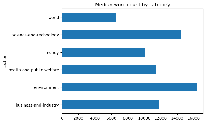
Here we can visually see the difference between the mean and median word count for the world category.
Visualizing estimator data#
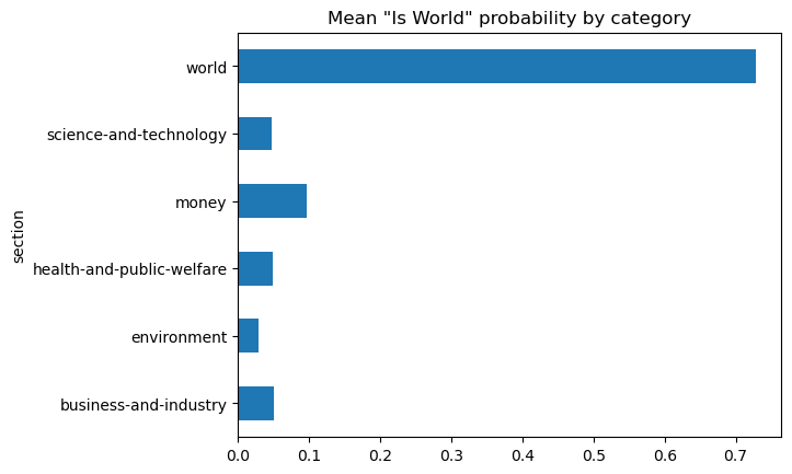
Now let’s create some data visualizations based on the “is_world” dataset.
world = pd.read_csv('../data/is_world.csv')
world.groupby('section').is_world.mean().plot(
    kind='barh', title='Mean "Is World" probability by category')
<Axes: title={'center': 'Mean "Is World" probability by category'}, ylabel='section'>
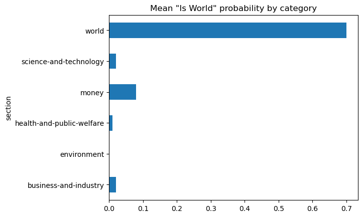
Using the same aggregation from section 6-1, we can now visually see how 70 percent of the “world” topic documents have been accurately classified. The next visualization shows the same chart for the probability data.
world_prob = pd.read_csv('../data/is_world_prob.csv')
world_prob.groupby('section').is_world_prob.mean().plot(
    kind='barh', title='Mean "Is World" probability by category')
<Axes: title={'center': 'Mean "Is World" probability by category'}, ylabel='section'>